Emma Duda

Emma Duda

UX/UI Designer

  • About
  • Projects
    • Libby Kids
    • Artlet
    • Department of the Interior
  • Resume
    • LinkedIn
    • Mail

Department of the Interior

Stewarding conservation and preserving our future.

Project Overview

Problem

The Department of the Interior encompasses so many government entities that having a website that’s clear and usable is crucial in users understanding the department’s purpose.

Solution & Value

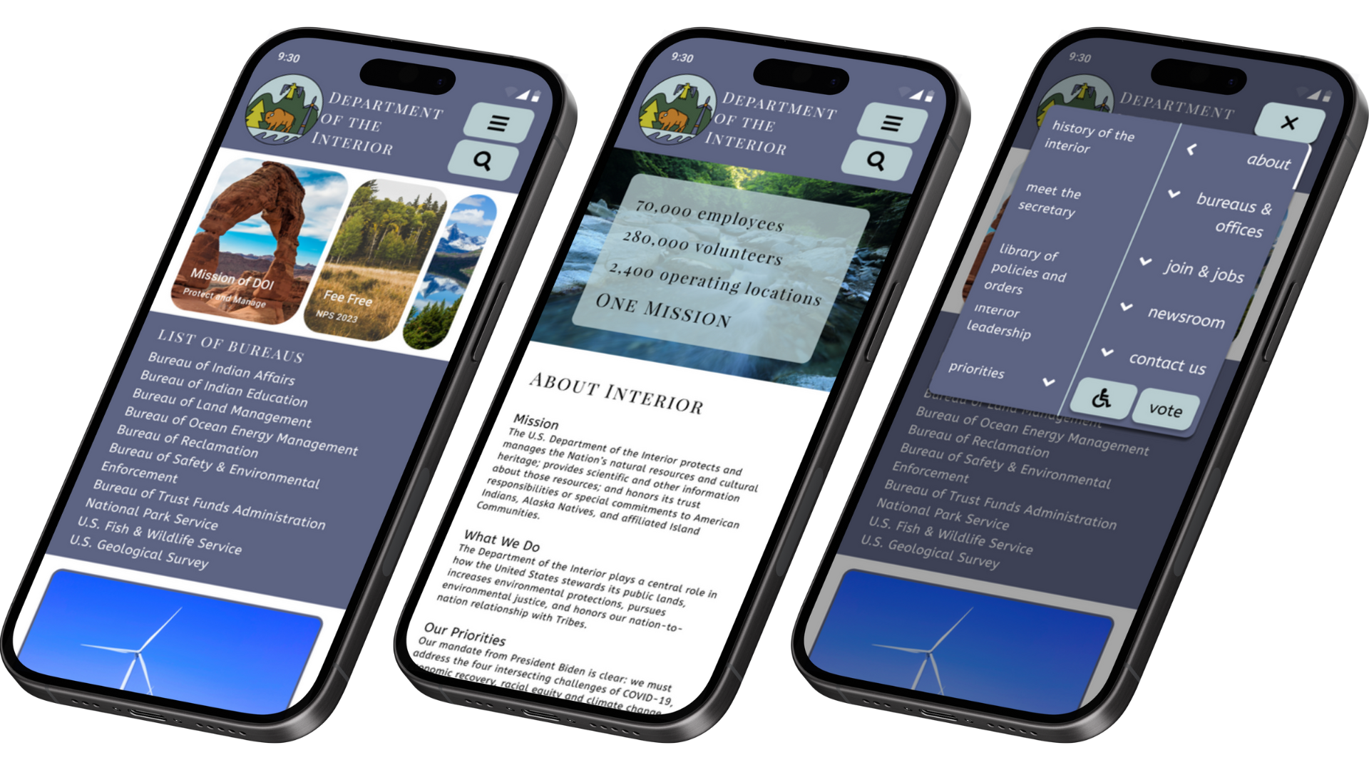
By redesigning the current site, my team improved navigation and make the mission and vision statements clearer so anyone who visits the site can easily understand what the Department of the Interior is all about.

My Role

UX/UI Designer

Tools Used

Figma, Google Drive, Zoom, Canva

Timeline

July 10 – 27th 2023

Contributors

Maneli Aygani, Danielle Clifford, Emma Duda, Ciana Froemming

Final Mock-Up

Process & Methodology

Making our way through the design cycle, from user research to user testing, we kept users in mind throughout the app’s creation.

Empathize


What’s the current site like?

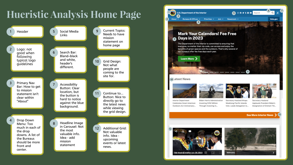
We began by conducting a heuristic analysis of the current site to better understand the current site organization and structure.

What do users need?

By conducting user research, we determined that returning to the homepage was difficult, and that the top navigation bar is not consistent across the site. This makes site navigation difficult for users, and provides many opportunities for friction.

Define


Site organization

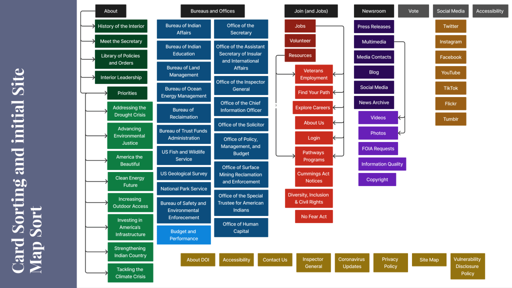
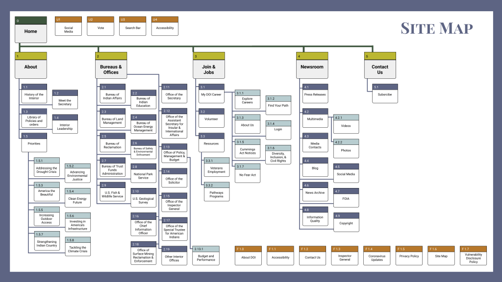
We then conducted card sorting and created a site map so we could better visualize the current organization of content across the site and reorganize that content in a meaningful way. so we could reorganize the site content in a meaningful way.

Ideate


Creating a Low-Fi Wireframe

We then created a low-fi wireframe of the site with our goals in mind. We also conducted A/B testing of the prototype to determine which course of action was most helpful for our users.

Prototype


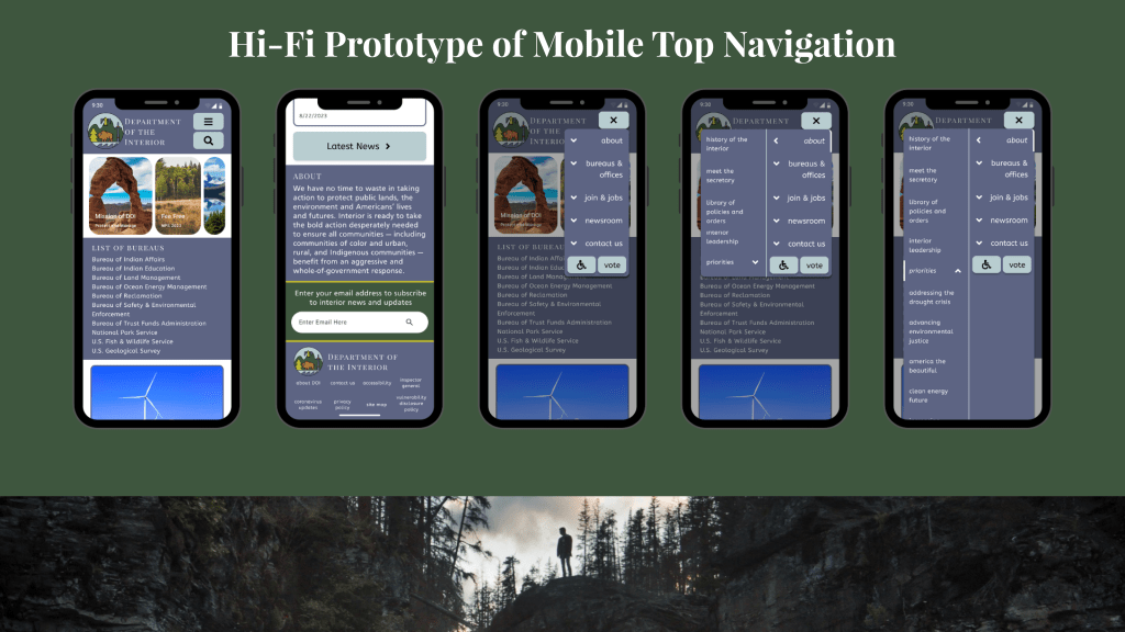
We then transitioned our low-fi wireframes to mid- and high-fi versions.

Test


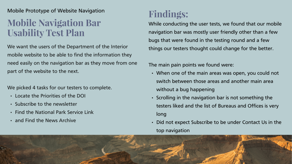
When testing our various prototypes, we focuses specifically on the site navigation. We wanted users to feel comfortable moving around the site and to know they could get back to the homepage when needed.

Conclusion & Learning Opportunities

The biggest challenge of this project was working with the large quantity of information on the current site. Figuring out how to organize that information so it wasn’t overwhelming was a main focus for my team, and we utilized design techniques to better communicate the content.

Emma Duda

Quick Links

About

Writing Samples

Resume

Projects

Libby Kids

Artlet

Department of the Interior

Get in touch

  • LinkedIn
  • Mail

  • Subscribe Subscribed
    • Emma Duda
    • Already have a WordPress.com account? Log in now.
    • Emma Duda
    • Subscribe Subscribed
    • Sign up
    • Log in
    • Copy shortlink
    • Report this content
    • View post in Reader
    • Manage subscriptions
    • Collapse this bar